Boosting efficient and consistent product delivery with ehacells
Ehacells is a design sytem library that redefined project implementation at ehealth for the wide of products/features shipped.
Company
ehealth Africa
ehealth Africa
Duration
12 Weeks
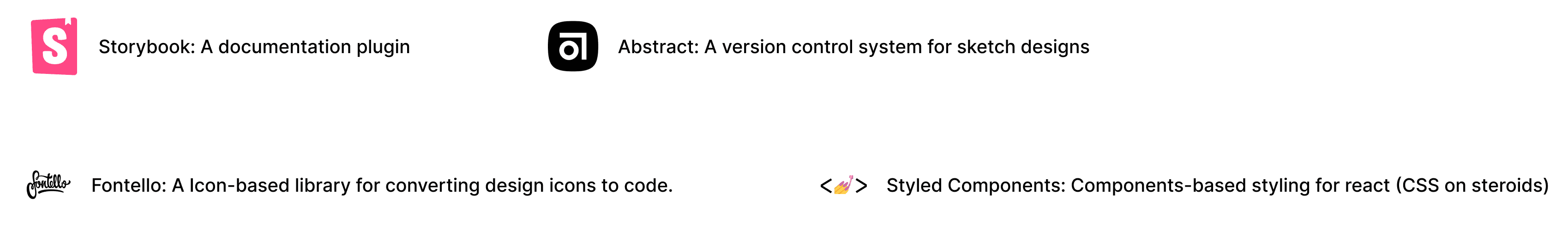
Tools
Storybook, Fontello, React, Sketch, Abstract
Team
2 Designers
2 Developers
1 QA
Core Responsibilities
UI/UX Designer
Visual Design
Interaction Design
Component Development
Usability Testing
Product Research
eHealth Africa is an organisation whose mission is to build stronger health systems by designing and implementing data-driven solutions that respond to local needs and provide underserved communities with tools to lead healthier lives.
This involves several cross-functional teams working together to develop multiple data-driven software products to satisfy the needs of the public health sectored organisations.
Problem Statement
With the rising demand to develop more quality and functional software products for better health delivery. Product teams were continually challenged to deliver products amidst tight deadlines while making organisational products even more consistent. Miro-project teams self-managed throughout the process, resulting in a diverse design approach.
Challenges
Provide a more scalable and accessible solution that promotes a more uniform consistent implementation across all products.
Deliver a solution that bridges communication gaps between several team members and enhances product team synergy.
Create a more efficient and effective way for teams to work on design and development, saving time and resources.
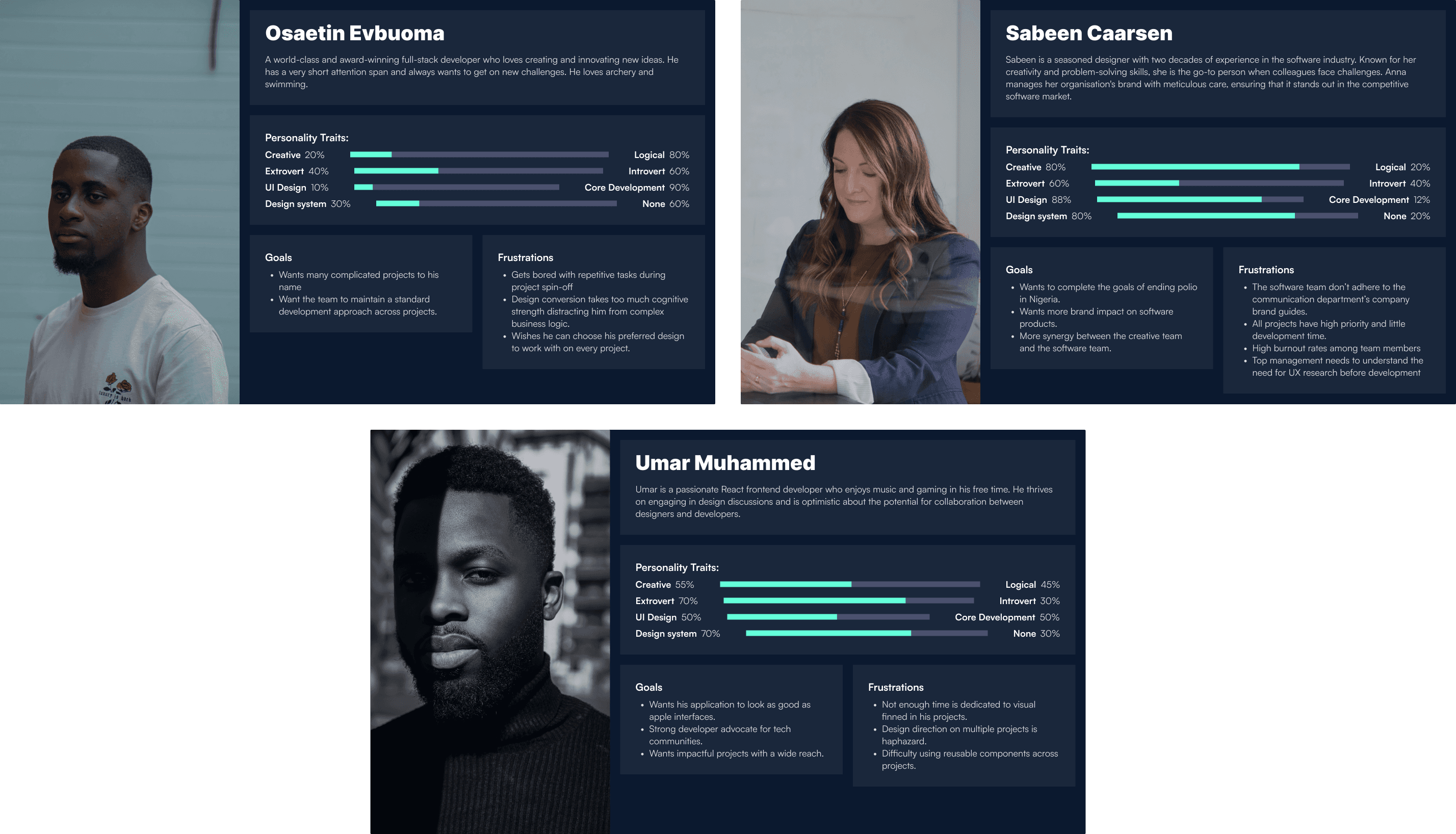
Discovery
A total of 15 members of the product team were interviewed in order to gain a deeper understanding of the challenges. Below is a list of some of the questions we asked.
What kind of work do you do?
Can you tell me what technology stack you use?
What affects the duration of your project?
What factors impact your project delivery?
What is the average time spent on the start-off of a project?
How do peer dependencies affect your delivery?
What boilerplate technology do you use to set up your projects?
What part of the system do you find frustrating?
Key Insights derived from the interviews
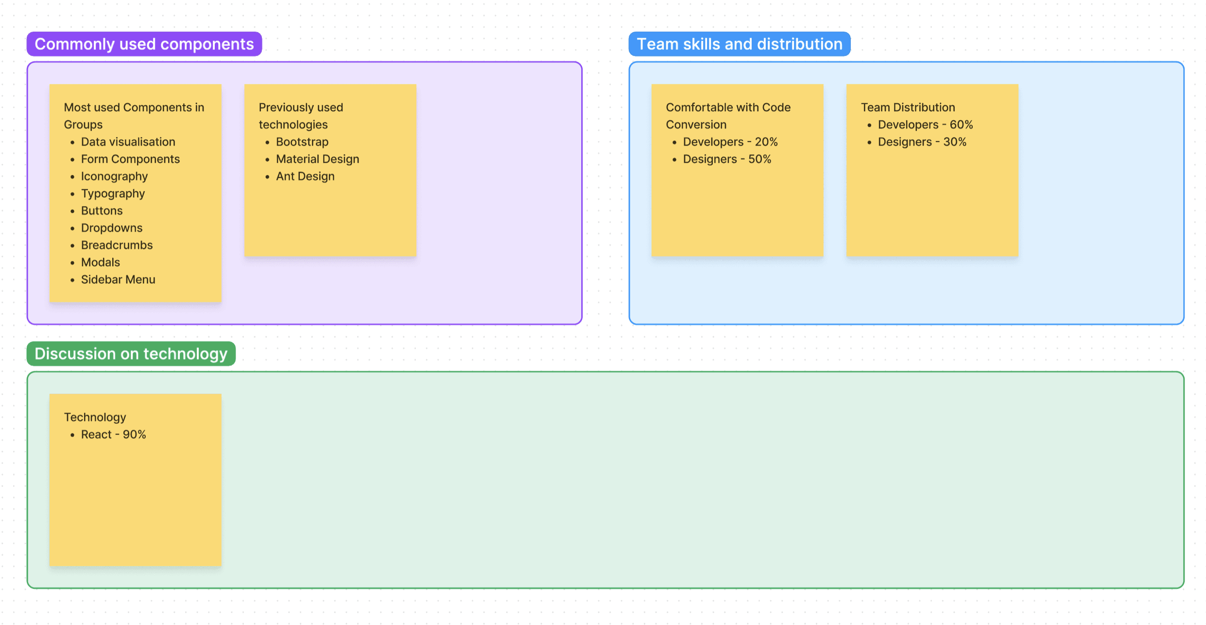
90% of frontend projects are react based
The majority of projects don’t use standard boilerplates.
Most of the development time was present on converting the designs to code.
Switching between design context and coding can be a burden for full-stack developers
A standard boilerplate is needed across projects/products.
Quantitative Research
We conducted a survey using Google Sheets and forms, to observe patterns in what the potential solution may contain. Below are the results.
Quantitative Research
Discovery
A total of 15 members of the product team were interviewed in order to gain a deeper understanding of the challenges. Below is a list of some of the questions we asked.
What kind of work do you do?
Can you tell me what technology stack you use?
What affects the duration of your project?
What factors impact your project delivery?
What is the average time spent on the start-off of a project?
How do peer dependencies affect your delivery?
What boilerplate technology do you use to set up your projects?
What part of the system do you find frustrating?
Key Insights derived from the interviews
90% of frontend projects are react based
The majority of projects don’t use standard boilerplates.
Most of the development time was present on converting the designs to code.
Switching between design context and coding can be a burden for full-stack developers
A standard boilerplate is needed across projects/products.
Quantitative Research
We conducted a survey using Google Sheets and forms, to observe patterns in what the potential solution may contain. Below are the results.
Quantitative Research

Ideate
Defined Assumptions
A general reduction in project startup development activities was needed.
Reduction in the time spent on design-to-code conversion was also essential.
There is a need for consistency across organisations' projects and products.
Designers need to contribute more to ensuring adherence to interactions and design brand direction.
The solution needs to be provided in react.
Provide proper documentation of resources.
Proposed Solution: A Design System
A Design system is a collection of reusable components, guided by design patterns and brand standards that can be used to build any interface, feature or complete application. It consists of Brand/Style guides and elements/components for UI implementations.
Using the organisation's existing brand guides as a starting point we developed two-component repositories to aid both ends of the development cycle.
Components of the Design System
Sketch
React
Development Journey Map
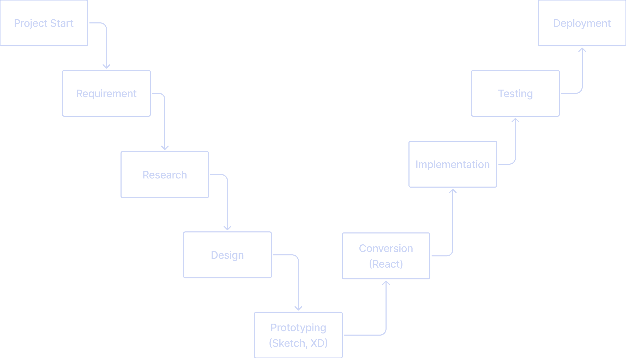
The design system can easily fit into workflows by providing resources during the Design, prototyping phase and design-conversion stage. This will also help reduce the cognitive load on designers when designing and building prototypes for new projects.
First Iteration
Component List
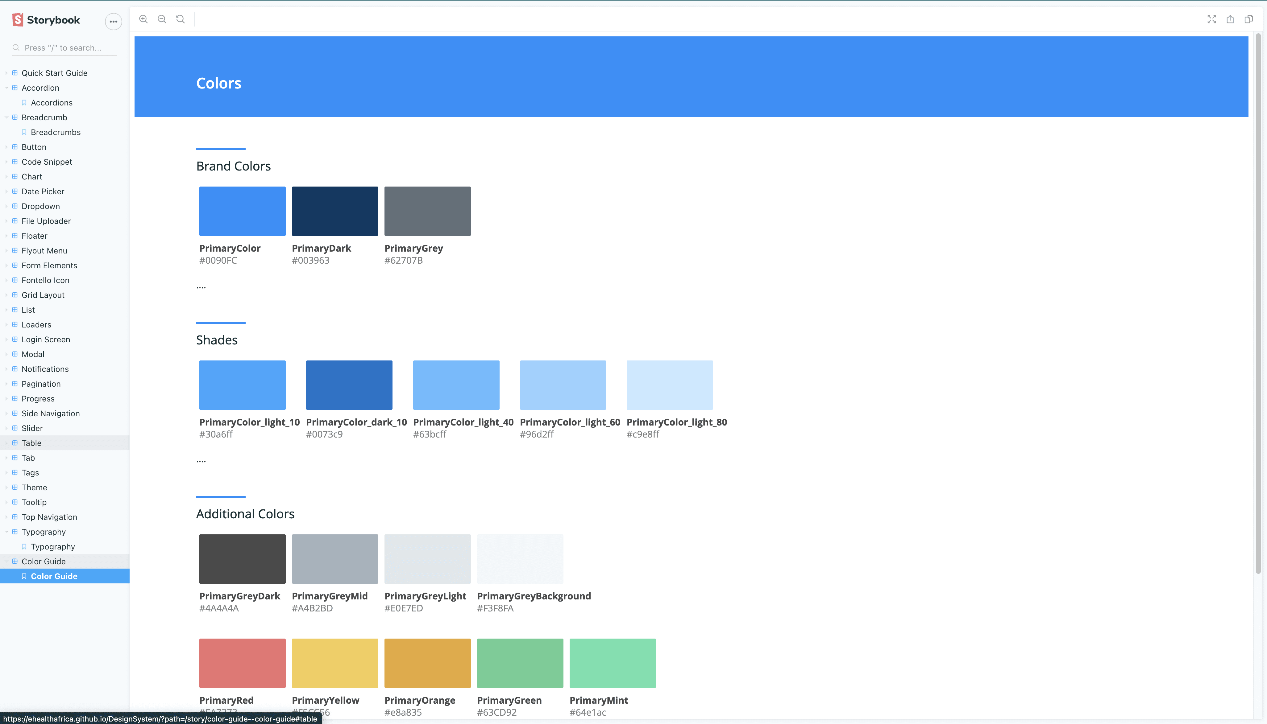
Colour Guide
Breadcrumb
Buttons
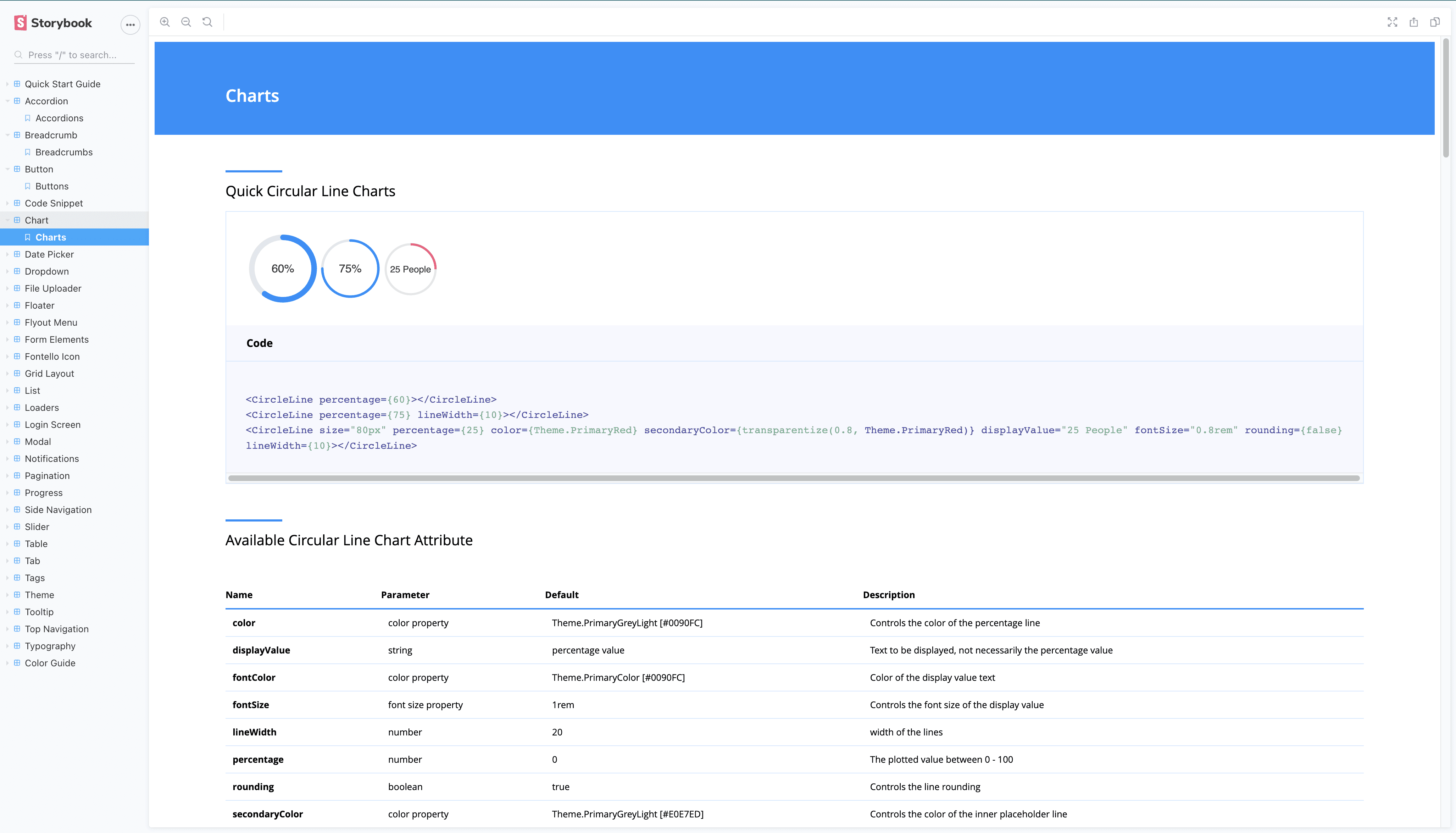
Chart
Dropdown
Form Elements
Iconography
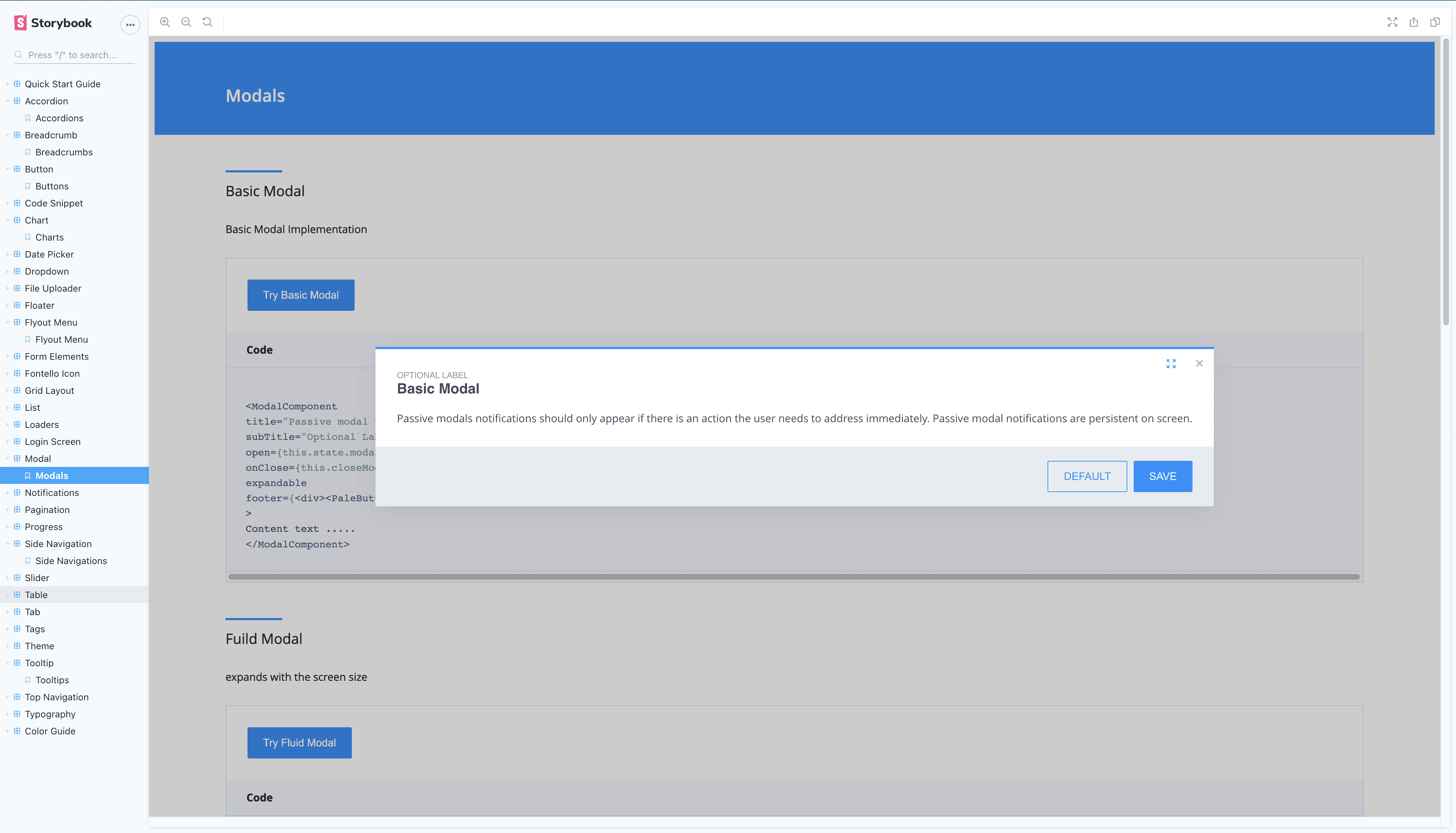
Modals
Tables
Navigations
Typography
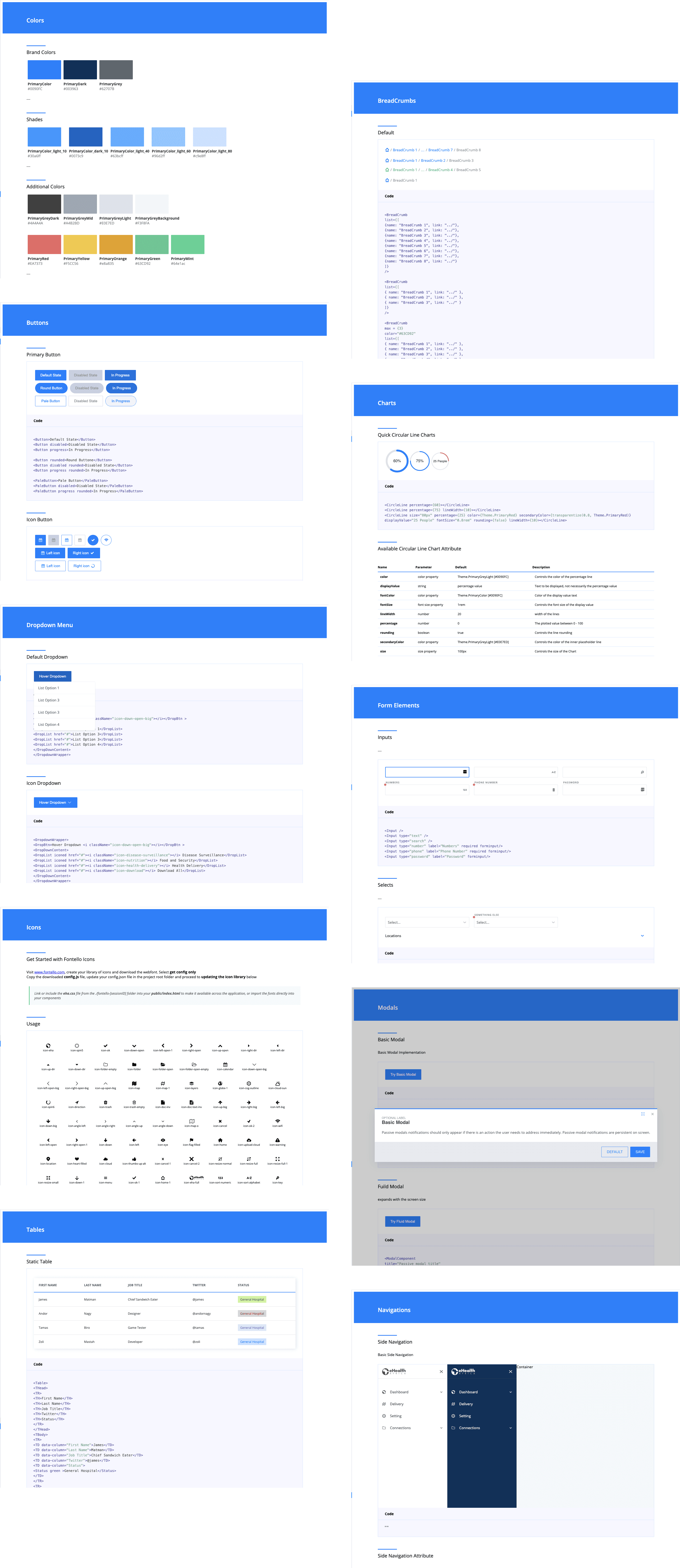
Support Resources
Testing
We had a collection of developers who evaluated the ease of implementing the design system on a fresh react project development. The task was to replicate a given dashboard mockup/prototype and give adequate feedback.
Installing the system on a fresh react project
Moving multiple folders is not efficient, what happens if the components are updated?
Why do I need to install several NPM components before using the library, is there a better way?
I like the fact that icons are embedded in the project, we don’t worry about deprecation
The documentation was clear but packaging the library as an NPM component should make things easier.
Making use of the components
Smooth, I like that the general colour scheme can be adjusted to fit any of our products.
Looks good and simple.
The Charts make building a dashboard so much easier.
I will like to have more of our recurring elements like Loaders, Tabs, Tooltips, Grids and Tags.
I love the extra attribute controls on some of the components.
Less headache from the communication department on brand alignment.
We took the feedback and expanded the design system to include more components, we also got the developers to help with deploying the repository to Testing
We had a collection of developers who evaluated the ease of implementing the design system on a fresh react project development. The task was to replicate a given dashboard mockup/prototype and give adequate feedback.
We took the feedback and expanded the design system to include more components, we also got the developers to help with deploying the repository to Node Package Manager (NPM) as a package that was installed as a module in applications. Using git and continuous integration we were able to manage the versions and deployments efficiently.
Second Iteration
Component List
Accordion
Date Picker
File Uploader
Map Floaters
Flyout Menu
Grid Layout
Sliders
Tooltip
Lists
Loaders
Login Screen
Notifications
Paginations
Progress bars
Tabs
Organisational Impact
50% time saving on development time
Hours were saved by eliminating time spent on recreating UI from scratch every time.
Efficient Logical Productivity
Engineers/Developers can now focus solely on the business logic which leads to shipping newer features/products faster.
Brand Alignment and Consistent Experience
UI elements now align in unison with the brand guide and we have a better coherent relationship across the design team.
This also ensures easy onboarding for new members of the team.
Comment for the Founder eHealth Africa - Evelyn Castle
The design team’s proposed solution has really reduced application development time within the organisation and also cut costs of hiring more resources when it's not really needed.
Challenges
Getting the management team onboard and having dedicated time allocation for the project.
Getting the developers to adopt the design-first approach to core development assets.
How we overcame the challenges
We got everyone's approval after the first iteration and demonstration. We were able to demonstrate a complete dashboard design from a blank project setup.
Ideate
Defined Assumptions
A general reduction in project startup development activities was needed.
Reduction in the time spent on design-to-code conversion was also essential.
There is a need for consistency across organisations' projects and products.
Designers need to contribute more to ensuring adherence to interactions and design brand direction.
The solution needs to be provided in react.
Provide proper documentation of resources.
Proposed Solution: A Design System
A Design system is a collection of reusable components, guided by design patterns and brand standards that can be used to build any interface, feature or complete application. It consists of Brand/Style guides and elements/components for UI implementations.
Using the organisation's existing brand guides as a starting point we developed two-component repositories to aid both ends of the development cycle.
Components of the Design System
Sketch
React
Development Journey Map
The design system can easily fit into workflows by providing resources during the Design, prototyping phase and design-conversion stage. This will also help reduce the cognitive load on designers when designing and building prototypes for new projects.
First Iteration
Component List
Colour Guide
Breadcrumb
Buttons
Chart
Dropdown
Form Elements
Iconography
Modals
Tables
Navigations
Typography
Support Resources
Testing
We had a collection of developers who evaluated the ease of implementing the design system on a fresh react project development. The task was to replicate a given dashboard mockup/prototype and give adequate feedback.
Installing the system on a fresh react project
Moving multiple folders is not efficient, what happens if the components are updated?
Why do I need to install several NPM components before using the library, is there a better way?
I like the fact that icons are embedded in the project, we don’t worry about deprecation
The documentation was clear but packaging the library as an NPM component should make things easier.
Making use of the components
Smooth, I like that the general colour scheme can be adjusted to fit any of our products.
Looks good and simple.
The Charts make building a dashboard so much easier.
I will like to have more of our recurring elements like Loaders, Tabs, Tooltips, Grids and Tags.
I love the extra attribute controls on some of the components.
Less headache from the communication department on brand alignment.
We took the feedback and expanded the design system to include more components, we also got the developers to help with deploying the repository to Testing
We had a collection of developers who evaluated the ease of implementing the design system on a fresh react project development. The task was to replicate a given dashboard mockup/prototype and give adequate feedback.
We took the feedback and expanded the design system to include more components, we also got the developers to help with deploying the repository to Node Package Manager (NPM) as a package that was installed as a module in applications. Using git and continuous integration we were able to manage the versions and deployments efficiently.
Second Iteration
Component List
Accordion
Date Picker
File Uploader
Map Floaters
Flyout Menu
Grid Layout
Sliders
Tooltip
Lists
Loaders
Login Screen
Notifications
Paginations
Progress bars
Tabs
Organisational Impact
50% time saving on development time
Hours were saved by eliminating time spent on recreating UI from scratch every time.
Efficient Logical Productivity
Engineers/Developers can now focus solely on the business logic which leads to shipping newer features/products faster.
Brand Alignment and Consistent Experience
UI elements now align in unison with the brand guide and we have a better coherent relationship across the design team.
This also ensures easy onboarding for new members of the team.
Comment for the Founder eHealth Africa - Evelyn Castle
The design team’s proposed solution has really reduced application development time within the organisation and also cut costs of hiring more resources when it's not really needed.
Challenges
Getting the management team onboard and having dedicated time allocation for the project.
Getting the developers to adopt the design-first approach to core development assets.
How we overcame the challenges
We got everyone's approval after the first iteration and demonstration. We were able to demonstrate a complete dashboard design from a blank project setup.
Conclusion
A design system is a living asset and continues to grow with the organisation, it is constantly evolving as we continue to implement more assets or modify existing assets to fit updated needs.
It is also not an easy task as it is a time-consuming endeavour but at the end of it all it pays back all its lot. Special thanks to all who contributed to its success
Samir
Douno
Muyiwa
Olajide
Sabeen
Farouk
Umar
The management team of eHealth Africa
Other Projects
I'm presently open to new creative endeavours, so if you believe I could be a great match for your team or venture, reach out, and let's transform your product concepts into reality.
Designed & developed by Victor Churchill. ©2023 All rights reserved
I'm presently open to new creative endeavours, so if you believe I could be a great match for your team or venture, reach out, and let's transform your product concepts into reality.
Designed & developed by Victor Churchill. ©2023 All rights reserved
I'm presently open to new creative endeavours, so if you believe I could be a great match for your team or venture, reach out, and let's transform your product concepts into reality.
Designed & developed by Victor Churchill. ©2023 All rights reserved
I'm presently open to new creative endeavours, so if you believe I could be a great match for your team or venture, reach out, and let's transform your product concepts into reality.
Designed & developed by Victor Churchill. ©2023 All rights reserved